

Access full report
Oops! Something went wrong while submitting the form.

🤍

Facilitated by The Modern Data Company in collaboration with the Modern Data 101 Community
Latest reads...
.png)
.png)

.png)

TABLE OF CONTENT


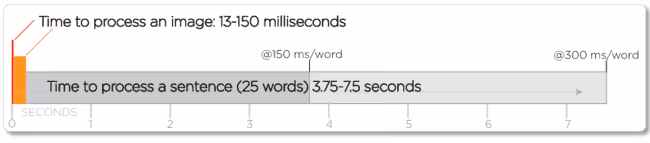
Here’s an interesting fact. Did you know that images are processed 6x-600x faster than words?
Translate this in the data space, a table of 10,000 rows tells you nothing at a glance; a well-constructed chart tells you the story in seconds. This makes patterns visible, such as trends, outliers, correlations, and clusters that hide inside raw numbers surface immediately when plotted. You don’t find these by staring at spreadsheets; you find them by looking at the right chart.
This article defines what charts are, their key types, how to choose the right chart type, and finally, how building a strong foundation for data visualisation with data products helps businesses scale.
A chart is a visual representation of data that helps people understand patterns, relationships, comparisons, or trends more easily than reading raw numbers. Charts translate data into shapes, lines, or bars so the human eye can interpret it quickly.
However, the definition of a chart can depend on who you ask. But understanding the distinction (and why it often doesn’t matter) gives you a stronger foundation for everything that follows.
That visual format can take many different forms, such as a chart, which might be a graph with plotted points and axes, a diagram showing hierarchical structure, a map shading geographic regions by value, or even a table presenting numbers in organised rows. What all of these have in common is the core purpose: making data easier to understand, compare, and act on.
To understand any chart, you need to understand two fundamental building blocks: dimensions and measures.
Measures are the quantitative values in your data, such as the numbers you want to analyse. Revenue, temperature, page views, customer count, and error rate. These are the things you are measuring, and they are the primary subject of most charts.
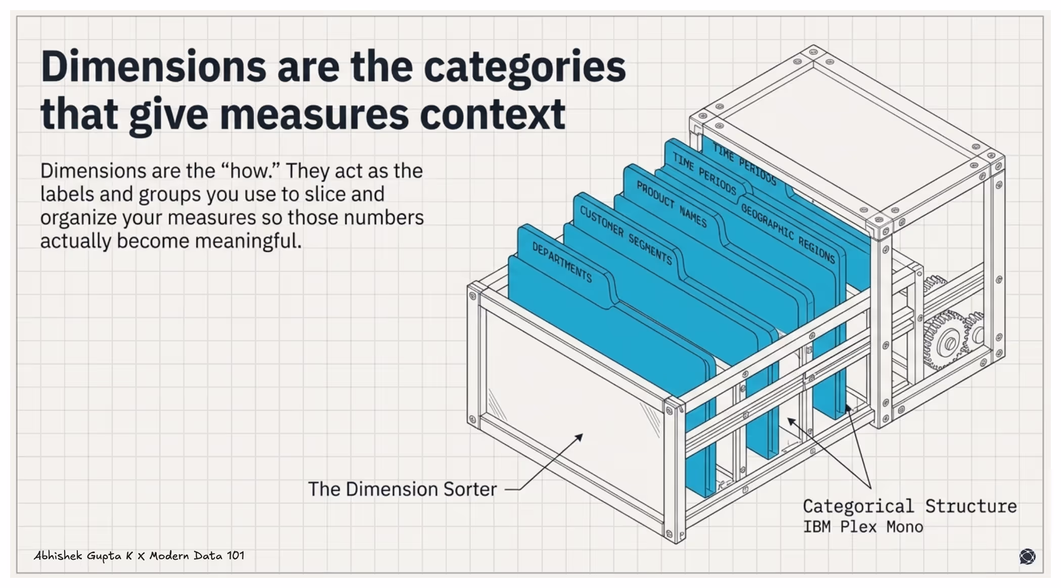
Dimensions are the categories, groups, or labels that give your measures context. Time periods, product names, geographic regions, customer segments, and departments. Dimensions are what you use to slice and group your measures, so they become meaningful.
When you build a chart, you are asking how measures behave across dimensions, such as revenue by product, users over time. The chart type determines how that relationship is encoded.
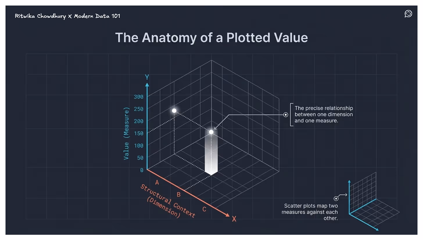
Most charts use Cartesian coordinates: the X-axis holds the dimension, the Y-axis holds the measure. Scatter plots put measures on both axes to show correlation. Bubble charts add a third variable through size or colour. Some charts skip axes entirely, such as pie charts, which use proportional angles, treemaps, which use nested rectangles, geographic charts, which use colour over maps, but the logic holds: dimensions provide structure, measures determine what gets visualised.
Understanding this dimension-measure relationship explains why some chart types work for certain questions and fail completely for others. It is also the foundation for the decision framework in the next section.
Earlier in this guide, we established that every chart is essentially built on two building blocks: measures (the numbers you want to analyse) and dimensions (the categories that give those numbers context). Getting that mapping right lets your chart tell a clear story.
Get it wrong, and even the most sophisticated visualisation falls flat.
Dimensions provide the context around the numbers. For instance, Date, Product, Customer, Region, and Channel. They answer questions like, Revenue by region, Users by device type, Orders by month.
A Measure answers a simple question: how much? In analysis, measures are the core signals. Everything else exists to segment, filter, or provide context to these numbers.
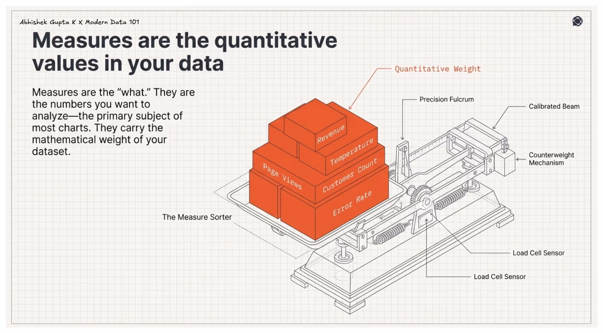
Measures can be aggregated using functions such as sum, average, count, minimum/maximum, such as Revenue, Units sold, Number of users, Cost, Profit
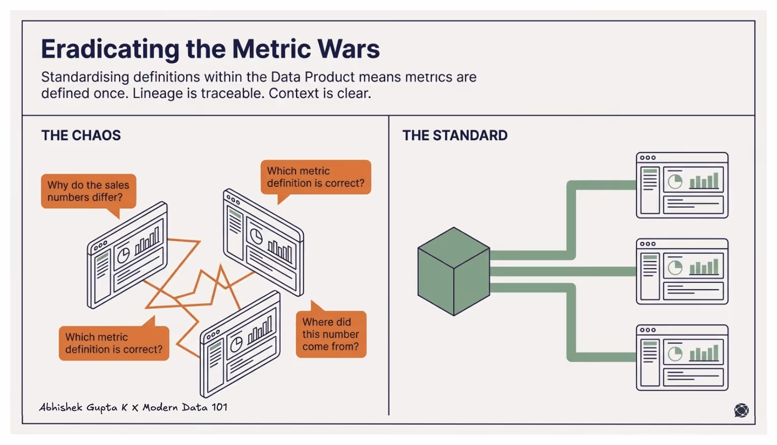
When charts are built in isolation, the mapping of measures and dimensions is defined ad hoc by whoever creates them. A sales analyst, finance team, and product manager may each define “revenue” or apply filters differently, leading to inconsistent charts, conflicting numbers, and misaligned conclusions.
Data products solve this at the root.
A data product is embedded with a semantic model, a structured, governed definition of the key entities in a business domain, along with metadata around their measures, dimensions, and the relationships between them.
The semantic model offers a unified view of entities, measures, and dimensions, the relationships, and the SLO checks, essentially everything the business needs in one trusted, reusable layer within the data product. When this semantic model feeds into the universal or global semantic layer of the organisation, it becomes the designated owner of the definitions, solving the problem of clashing definitions when it comes to metrics, measures, and dimensions.
The data product is now the source of truth for all the assets it is managing. This comes to effect due to the product approach that is employed during the design, develop, and deploy stages in the data product lifecycle. It is the responsibility of the data product manager to resolve conflicts and myriad definitions at the root while productising the assets like measures and dimensions.
This means in practice that the mapping work, deciding what "revenue" means, which time dimension it should be sliced by, and how customer segments are defined, is done once, validated, and then made available to every chart, dashboard, and report that draws from that data product.
Instead of every analyst re-doing that work individually (and potentially doing it differently), the measures and dimensions are pre-defined, pre-agreed, and consistent across the organisation.
This is the shift from charts as one-off outputs to charts as the visible layer of a deeper, well-structured data asset. The chart types you choose to explore the relationship between marketing spend and conversion remain exactly as important as this guide has described. But the quality, consistency, and trustworthiness of those charts are now underpinned by the semantic model that the data product provides.
A Data Product packages data with clear semantics, documentation, ownership, and quality guarantees. When dashboards or reports consume such datasets, metrics are already defined and standardised, the data is cleaned and curated, lineage is traceable, and context about fields is clear.
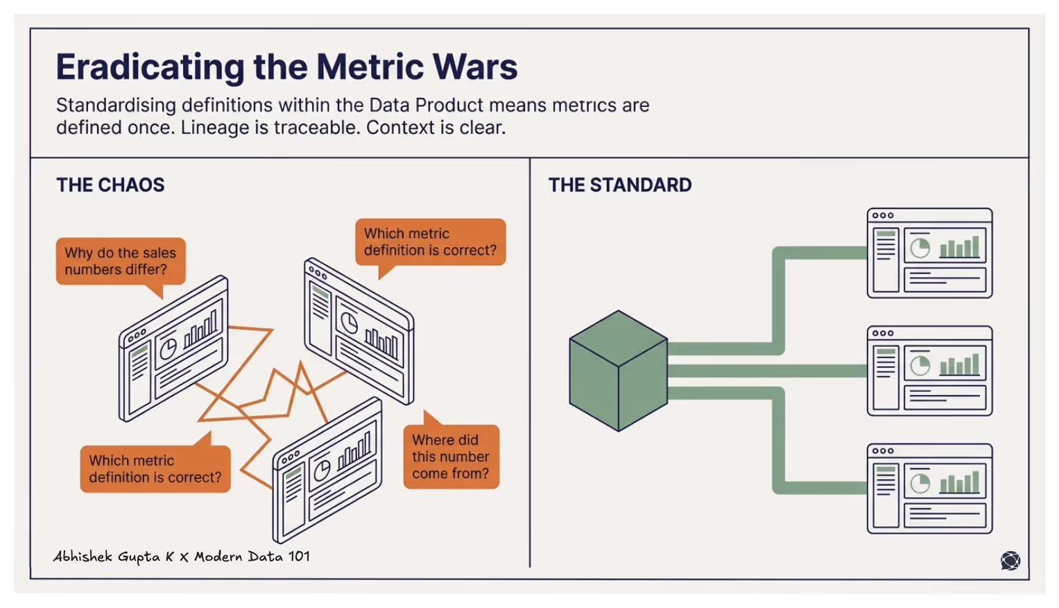
This means visualisation tools eliminate the common problems like:
Why do the sales numbers differ across dashboards? Which metric definition is correct? Where did this number come from?
Without data products, visualisation teams rarely spend most of their time actually visualising. They spend it cleaning data, rebuilding transformations, reconciling conflicting definitions, and debugging pipelines that broke when something upstream changed. The chart is the last five minutes of a process that took five days.
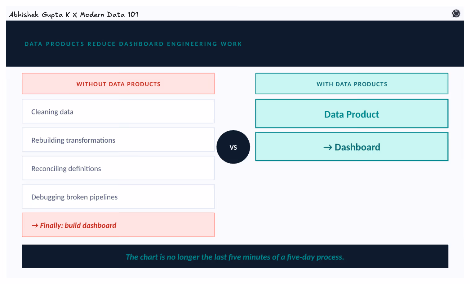
Data products move the heavy lifting upstream. By the time data reaches the visualisation layer, it is already clean, modelled, and ready to consume. The workflow shifts from raw tables → custom SQL → data fixing → dashboard to simply a data product → dashboard.
That fundamentally changes what visualisation teams are able to do with their time.
A well-built data product becomes a shared analytical foundation that any team can build on. A Customer 360 data product, a Revenue metrics data product, and a Marketing attribution data product, each one can power multiple dashboards, applications, and analytical tools simultaneously, all drawing from the same governed dataset.
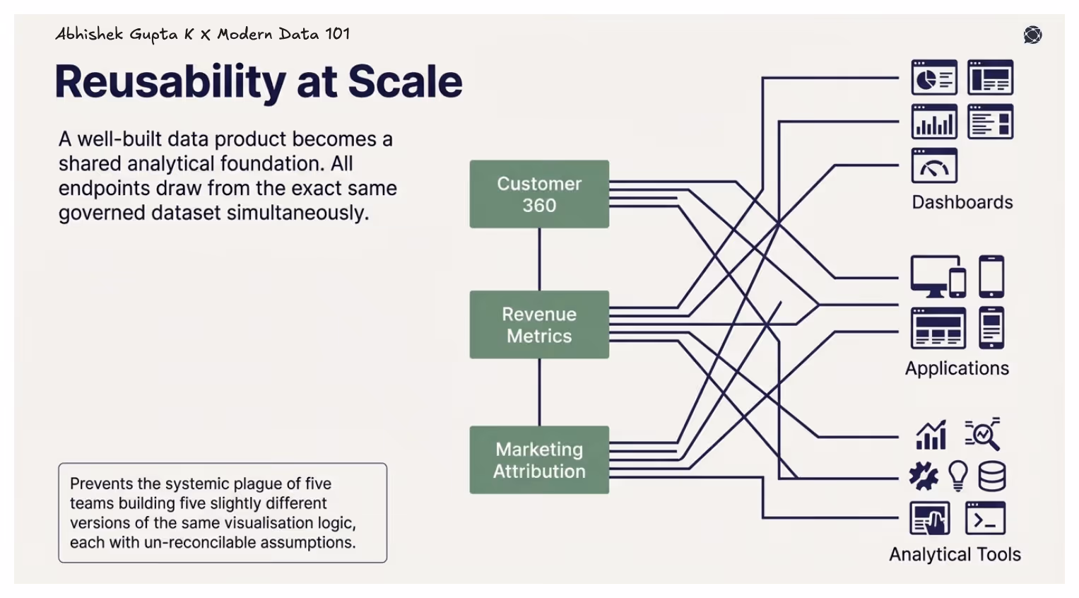
This prevents the situation that plagues most data organisations: five teams building five slightly different versions of the same visualisation logic, each with its own assumptions baked in, none of them fully reconcilable with the others.
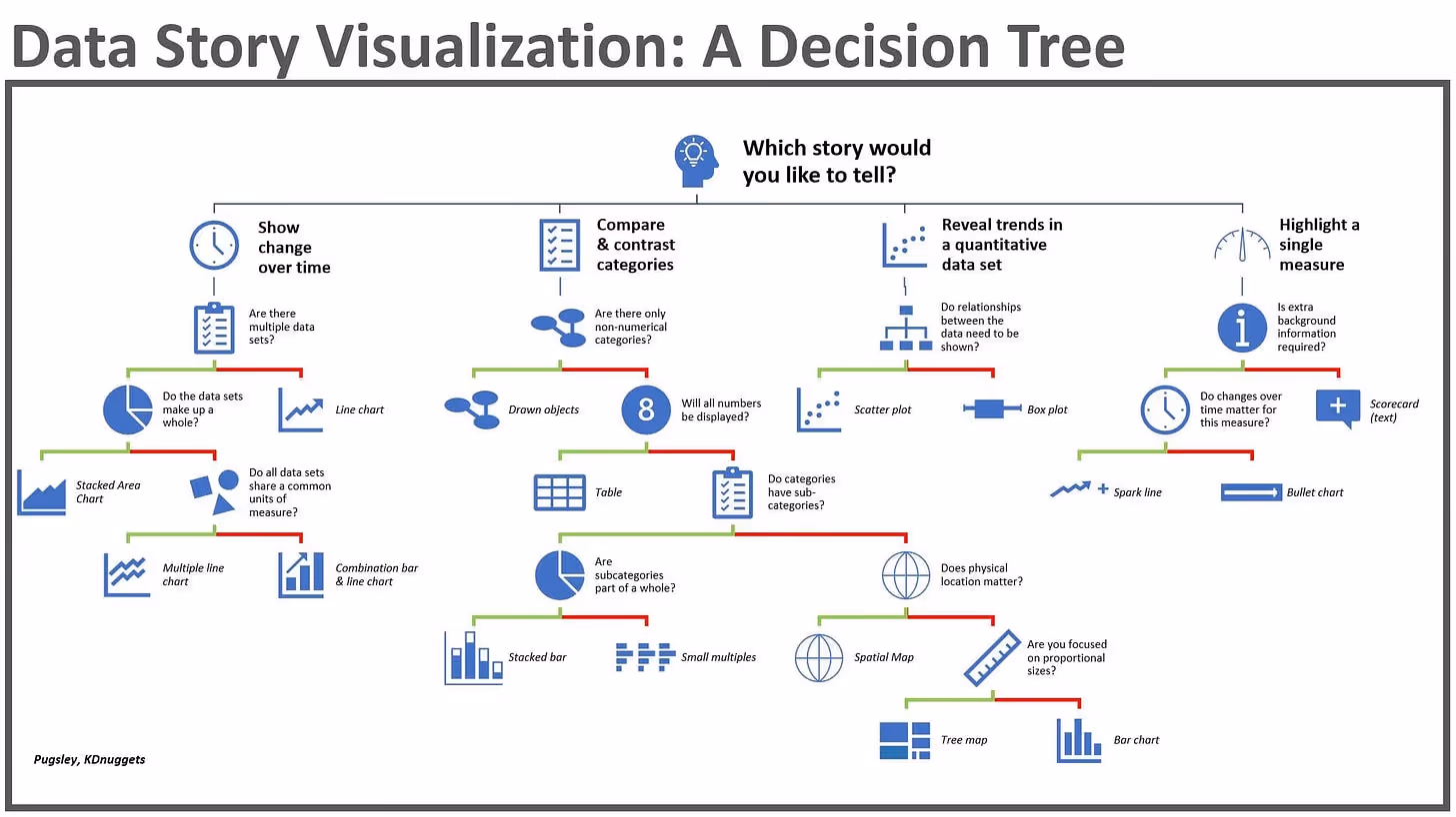
The most common mistake in visualisation is starting with the chart. People open a BI tool, scan the options, pick something that looks right, and work backwards. The result is often technically correct but analytically weak, a chart that shows data but answers nothing.
The right starting point is the question.
Every chart exists to answer a specific question or support a conclusion. Before opening a visualisation tool, you should be able to clearly state what you want to show, whether it is comparison, trend, composition, relationship, distribution, or geography.
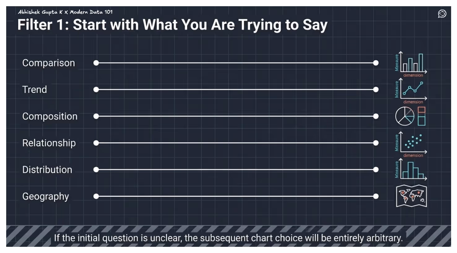
Each of these intents maps directly to a family of chart types. Comparison leads to bar charts, trends to line charts, composition to pie or stacked charts, relationships to scatter plots, distributions to histograms, and geographic questions to maps. If the question is unclear, the chart choice will be arbitrary.
Once the question is defined, the structure of your data narrows the choice further. Most charts are built around two variables, which are a dimension and a measure, but additional variables require encodings like colour, size, or secondary axes.
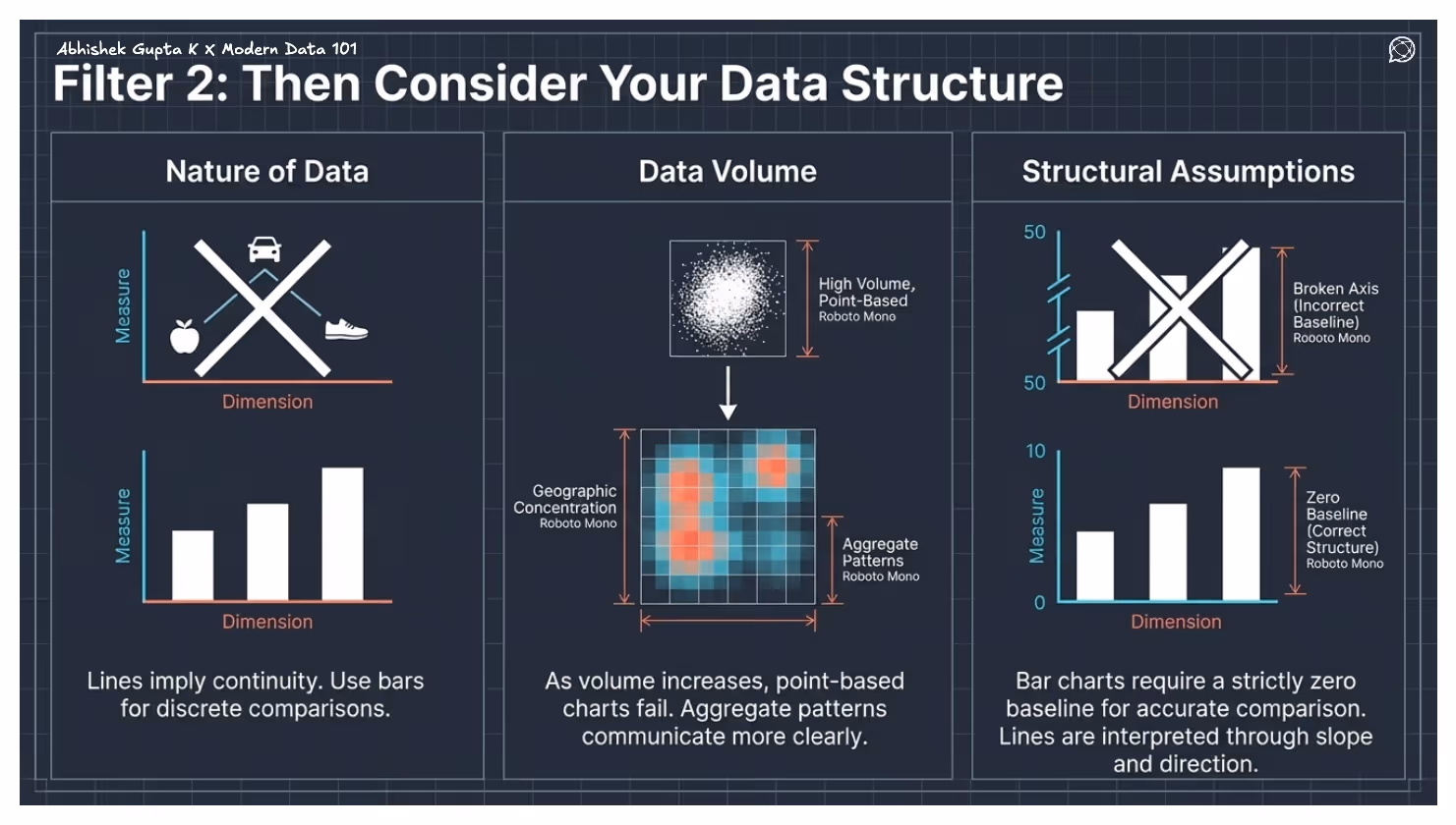
The nature of the data also matters. Line charts imply continuity and should not be used for unordered categories. Bar charts are more reliable for discrete comparisons. As data volume increases, point-based charts like scatter plots become less effective, and aggregated views such as heatmaps or density plots communicate patterns more clearly.
Finally, some chart types depend on structural assumptions. Bar charts require a zero baseline for accurate comparison, while line charts are interpreted through slope and direction. Ignoring these constraints leads to misleading visuals.
The effectiveness of a chart depends on who is reading it. A technically precise chart is not useful if the audience cannot interpret it.
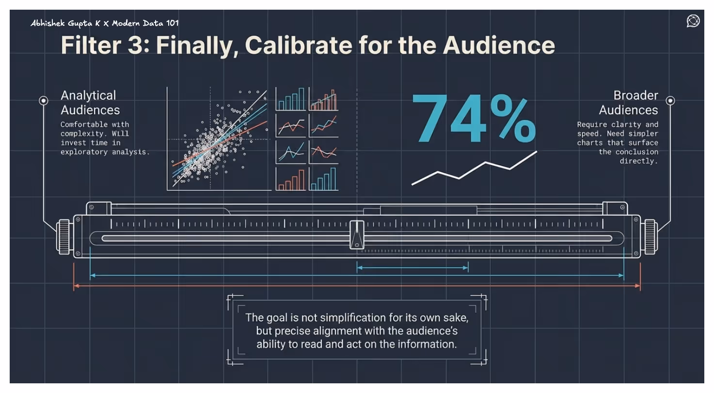
More analytical audiences are comfortable with complex visuals and will invest time in exploring them. Broader audiences need clarity and speed, which is simpler charts that surface the conclusion directly. The goal is to align with the audience’s ability to read and act on the information.
As a starting point, most chart selection can be reduced to the intent behind the question. Comparisons are best shown with bars, trends with lines, compositions with stacked or proportional charts, distributions with statistical plots, relationships with scatter-based visuals, and geographic patterns with maps.
This mapping prevents common missteps and anchors the choice in purpose rather than preference.
Choosing the right chart is a skill. Knowing why a bar chart outperforms a pie chart, or why a scatter plot reveals what a table cannot, makes you a sharper analyst and a more effective communicator.
But chart literacy alone is not enough.
A well-chosen chart built on inconsistent, ungoverned data will always be fragile, useful once, and trusted by few. Data products close this gap. When measures and dimensions are defined once and governed centrally, every chart built on top inherits that trust. Visualisation becomes a reliable organisational capability.
Charts communicate. Data products ensure that communication is always worth trusting. Build both well, and your data stops being something your organisation reports on, and starts being something it acts on.
The primary types of data visualisation include:
Yes, but there could be limitations. ChatGPT can:
But it doesn’t replace BI tools; instead, it complements them.
The most commonly referenced 7 stages of data visualisation’s progression are:
This originates from Ben Fry’s data visualisation pipeline from his book Visualising Data (2008). In practice, most applied frameworks collapse these into fewer stages, but Fry’s seven remain the most cited academic reference.
Your Copy of the Modern Data Survey Report
Better decisions start with shared insight.
Pass it along to your team →
Your Copy of the Modern Data Survey Report
Better decisions start with shared insight.
Pass it along to your team →


Find more community resources
Modern Data 101 is a movement redefining how the world thinks about data. A community built by the same team behind the world’s first data operating system, Modern Data 101 sits at the intersection of data, product thinking, and AI. Spread across 150+ countries, the community brings together a global network of practitioners, architects, and leaders who are actively building the next generation of data systems.
At its core, Modern Data 101 exists to simplify the journey from raw data to tangible and observable impact. It advocates high-potential data systems and next-gen architectures to unify and activate insights and automation across analytics, applications, and operational workflows at the edge.
In a world shifting from data stacks to AI ecosystems, Modern Data 101 helps teams not just navigate the change but lead it.

Find all things data products, be it strategy, implementation, or a directory of top data product experts & their insights to learn from.
Connect with the minds shaping the future of data. Modern Data 101 is your gateway to share ideas and build relationships that drive innovation.
Showcase your expertise and stand out in a community of like-minded professionals. Share your journey, insights, and solutions with peers and industry leaders.


